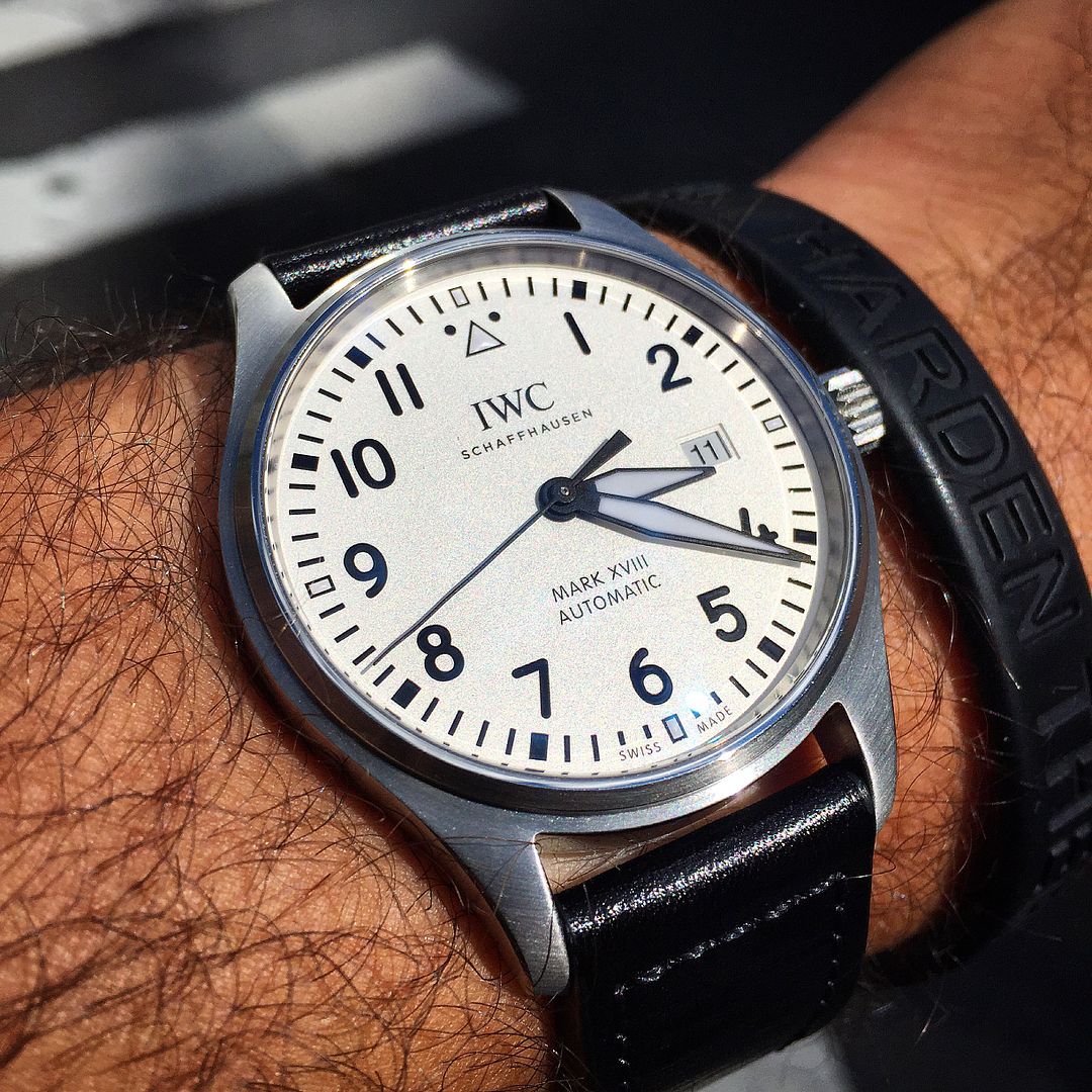
IWC Mk XVIII: The modern minimalist watch.
Hodinkee got this one wrong out of the gate with this being the Selitta which stirred-up a little controversy on the evolution of the "pure breed" Mark line... this 40mm offering is the 2892-A2 (IWC cal. 30110) and the 36mm pilot is the Selitta. Not to say the Selitta is inferior as it packs +4 jewels, but it's nice to have the proven workhorse movement under the hood for a number of reasons, especially considering it goes back to the MK XV which is the most modern version in overall aesthetics to the original WWWs. I realize it's subjective, but I was reluctant in giving Sellita a chance as an old-school ETA fan over the years.. A personal mental block in taking on that evolution just yet.
Now, not sure what that all says about the date window placement being slightly to the left, which brought the Selitta usage into question from the start, but when you wear the watch it doesn't matter a bit, and dare I say it, works great! If you're that guy that cannot get past the date window being a millimeter or so to the left, then this isn't your watch. But if you look at it as a study in new date window placement, then it's a welcome adjustment that just works after an a minute of staring. Plus, as we ALL know, when looking at macro shots of new watches, we're often put off by them and overly critical (Pelagos V.2.0 anyone?), until we see it in the flesh (at 40mm in this case).
Might I add, too, that I've owned two other 2892-A2s over the years and must say that while they both wound buttery smooth, there must be angels massaging the movement on every wind here. Impressive.
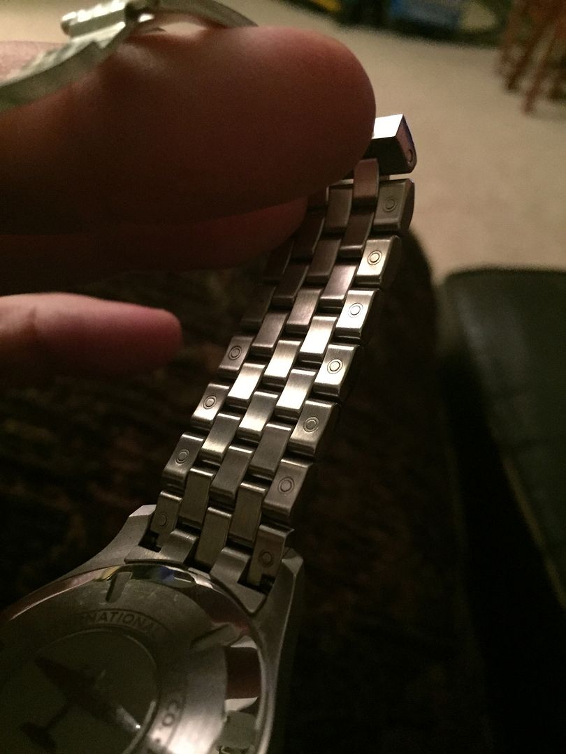
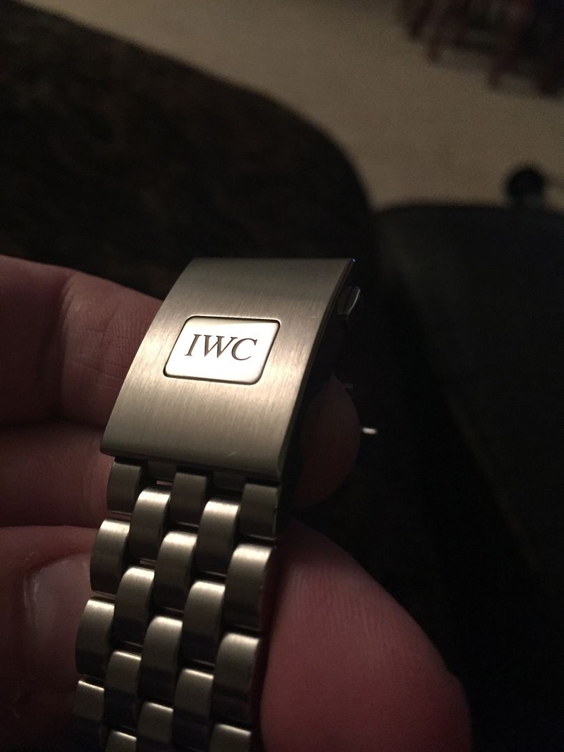
This is my first IWC so talking about the bracelet and clasp may be old news to many, but having dabbled in everything from the SD4000 (glidelock), Easy link (216570, 116710), wanting so much more in GS bracelets, and desperately wanting that old SJ 16710 feel back, I have to concede to IWC being the bracelet king at this price point. The quick release link adjustment is ingenious and their push-button clasp adjustment sits somewhere comfortably between the easy link and glidelock.
I will also say that the endlink-to-case tolerances may be the tightest I've ever experienced. It's like wearing the equivalent of feeling that precise power-steering in a fine modern sports car around the track which you swore was made from a solid CNC'd billet of german steel. It's that solid.
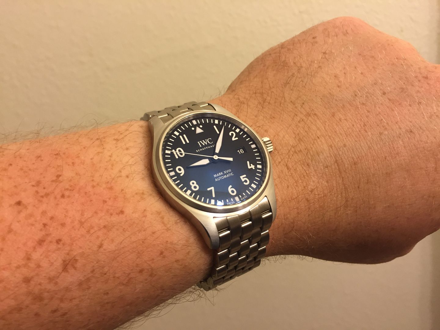
So much legibility, low-profile comfort, impeccable finishing, heritage, and the perfect timeless size. Total winner if you're tired of the big watch craze! I am smitten...
My 6.75"-7" wrists:
Last edited by sierra11b on Sat Sep 17, 2016 6:30 am, edited 1 time in total.
- mikeylacroix
- Posts: 3746
- Joined: Fri Dec 05, 2014 7:00 am
- Name: Mike
Re: IWC Mk XVIII: The modern minimalist watch.
I love this watch. Like I said earlier, great pickup and so happy for u !
Sent from Tapatalk
Sent from Tapatalk
- Americandave
- Posts: 403
- Joined: Mon Dec 01, 2014 2:44 am
- Name: Dave
Re: IWC Mk XVIII: The modern minimalist watch.
I've always thought of IWC as a sleeper watch. They have impeccable fit and finish and the designs are just timeless. But they aren't in your face like other brands.
Re: IWC Mk XVIII: The modern minimalist watch.
Badass. One of the few watches IWC has gotten right in the last few years.
- JP Chestnut
- Posts: 17867
- Joined: Mon May 27, 2013 10:40 am
- Name: Jacob
- Location: Ithaca, NY USA
Re: IWC Mk XVIII: The modern minimalist watch.
Timeless isn't the first thing I think of when looking at most of their watches. I think going with a new watch was the right call.Americandave wrote:I've always thought of IWC as a sleeper watch. They have impeccable fit and finish and the designs are just timeless. But they aren't in your face like other brands.
Re: IWC Mk XVIII: The modern minimalist watch.
=================dukerules wrote:Badass. One of the few watches IWC has gotten right in the last few years.
+1....that bracelet is awesome..
- rockmastermike
- Feedback Virtuoso
- Posts: 21134
- Joined: Tue May 18, 2010 5:13 pm
- Name: WDE
Re: IWC Mk XVIII: The modern minimalist watch.
Live that bracelet and just about everything else about that watch!
- Americandave
- Posts: 403
- Joined: Mon Dec 01, 2014 2:44 am
- Name: Dave
Re: IWC Mk XVIII: The modern minimalist watch.
JP Chestnut wrote:Timeless isn't the first thing I think of when looking at most of their watches. I think going with a new watch was the right call.Americandave wrote:I've always thought of IWC as a sleeper watch. They have impeccable fit and finish and the designs are just timeless. But they aren't in your face like other brands.
I was thinking mainly of their chronos - the spitfires were a sweet series.
- unixshrk
- This. Truth.
- Posts: 10630
- Joined: Wed Oct 12, 2011 8:29 am
- Name: Chris
- Location: North Texas / Colorado
Re: IWC Mk XVIII: The modern minimalist watch.
That's a great looking watch.
Re: IWC Mk XVIII: The modern minimalist watch.
Classic watch. Nice!
- craniotes
- Thread Pooper
- Posts: 9578
- Joined: Thu Dec 03, 2009 7:19 am
- Name: Ad Rock
- Location: Manhattan
Re: IWC Mk XVIII: The modern minimalist watch.
The new Mark XVIII gets so much right; they really are a fantastic return to form for a brand that that seems to have been losing its way in recent years. In fact, I find most of the updated Pilot's collection to be an improvement.
Anyway, enjoy your new watch; I know I'm enjoying mine:
(Now, about that bracelet...)
Regards,
Adam
Anyway, enjoy your new watch; I know I'm enjoying mine:
(Now, about that bracelet...)
Regards,
Adam
CAPT. THREAD POOPER
Re: IWC Mk XVIII: The modern minimalist watch.
Nice and clean
Sent from my iPhone using Tapatalk
DEATH FROM ABOVE
Re: IWC Mk XVIII: The modern minimalist watch.
I'd love to get the silver dial someday years from now if/when prices come down, but as it stands the black on bracelet is wonderful.
It's strange... If I had to recommend one watch at an $8k budget it would be the SD4000, which is a big flip regret for me. This watch somehow clicks most the same buttons that watch did even though they're totally different styles.
Now, if I had to recommend two watches at that budget it'd be the this and the speedy pro, but if I were faced with someone wanting a different colored dial I might recommended both the black and silver... Love the petit prince but its white date puts the silver ahead.
-
- Posts: 6327
- Joined: Thu Jun 09, 2011 8:56 am
- Name: Keith
- Location: The Slaughtered Lamb
Re: IWC Mk XVIII: The modern minimalist watch.
Love, love, love. Congrats!
- toxicavenger
- President Tranny
- Posts: 48254
- Joined: Fri Mar 12, 2010 8:25 am
- Name: HeadDIK
- Location: Colorado Springs
Re: IWC Mk XVIII: The modern minimalist watch.
Super sweet Eric!
Website: http://smallwhitestubbies.com/
Re: IWC Mk XVIII: The modern minimalist watch.
Love it
pure awesomeness :
(adj) The condition of having no faults, being completely extreme, and incredibly sick at life.
Who is online
Users browsing this forum: No registered users and 36 guests